5️⃣Call to Action (CTA)
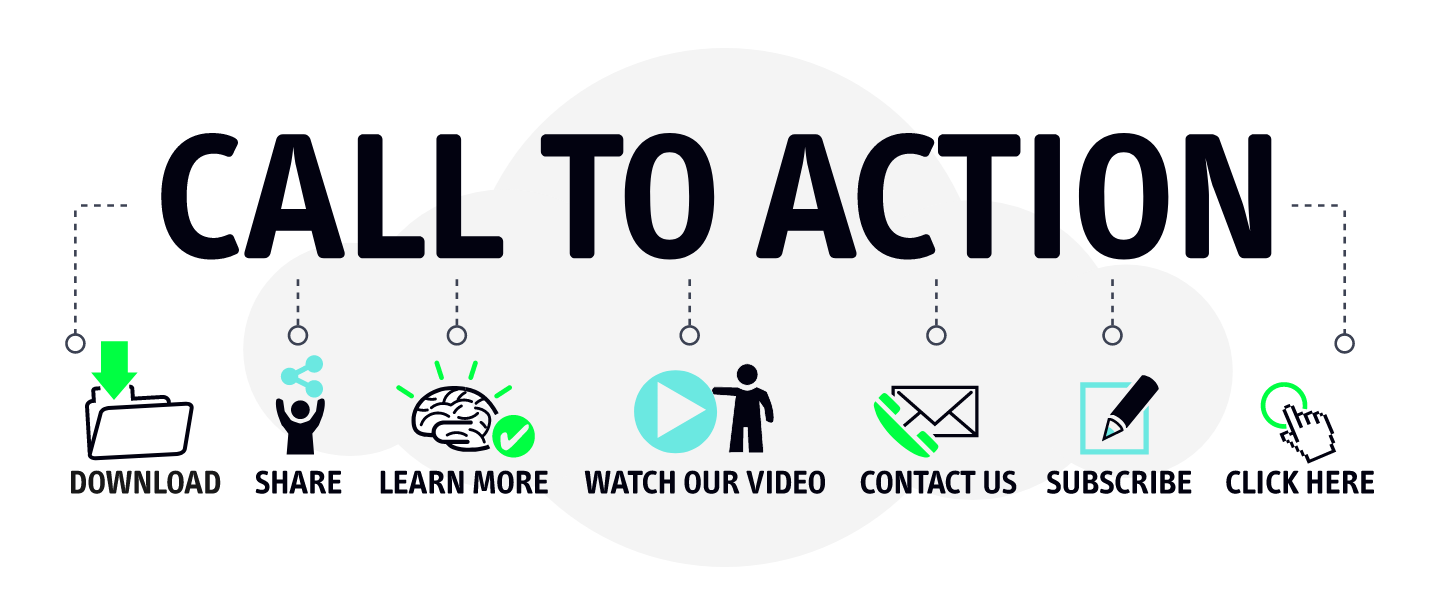
A Call to Action (CTA) is a crucial component in copywriting that serves as the final push to encourage your audience to take a specific desired action. It's a clear and actionable statement that directs readers or viewers toward the next steps you want them to follow. Whether you're aiming to make a sale, gather leads, drive website visits, or engage in any other action, a well-crafted CTA can significantly impact the effectiveness of your message. Here's how to create effective CTAs:
Be Clear and Direct: Your CTA should be straightforward and leave no room for confusion. Use concise language that clearly communicates the action you want the audience to take.
Use Action-Oriented Language: Employ verbs that inspire action, such as "buy," "subscribe," "download," "learn," "register," or "get started." These words create a sense of urgency and motivate readers to act immediately.
Highlight Value: Emphasize the benefits or rewards of following through with the CTA. Explain how the action will enhance the reader's life or solve their problem.
Create a Sense of Urgency: Incorporate words or phrases that convey urgency, like "limited time offer," "act now," or "don't miss out." This encourages readers to take action promptly.
Make it Visually Distinct: Use formatting techniques such as bold text, contrasting colors, or buttons to make the CTA stand out from the rest of the content.
Position Strategically: Place the CTA where it's most likely to capture the audience's attention. It's common to position it towards the end of the content or in a prominent location.
Tailor to the Audience: Understand your target audience and tailor the CTA to their needs and interests. Speak their language and address their pain points.
Keep it Short: Aim for brevity. Short CTAs are more memorable and easier for the audience to process quickly.
Use First Person: Frame the CTA in the first person, which personalizes the interaction and makes the audience feel like they're directly involved.
Offer Incentives: Sometimes, offering incentives like discounts, free trials, or exclusive content can make your CTA more appealing.
Examples of effective CTAs:
"Shop Now and Save 20%!"
"Download Your Free E-book Today!"
"Join Our Community and Start Learning!"
"Get Started on Your Fitness Journey!"
"Book Your Dream Vacation Now!"
CTAs are the driving force behind conversions and engagement in your marketing efforts. By using persuasive language, clear instructions, and a compelling value proposition, you can guide your audience towards taking action and achieving your desired outcomes.
Case Study: "My Bola" Football Club - Engaging Fans with Effective CTAs
Background: "My Bola" is a passionate and community-driven football club that aims to connect football enthusiasts and promote a healthy and active lifestyle through the beautiful game. The club hosts regular matches, training sessions, and social events for players of all skill levels.
Challenge: The club wants to increase its member base and engagement among football enthusiasts in the local community. They seek to create a website that effectively showcases their offerings and encourages visitors to join the club, participate in events, and stay updated on upcoming matches.
Solution: To address this challenge, "My Bola" implemented a strategic use of CTAs throughout their website. Here's how they structured their CTAs to engage and convert visitors:
Homepage:
Attention-Grabbing CTA Banner: At the top of the homepage, a bold banner with the CTA "Join Us and Play the Beautiful Game!" immediately captures visitors' attention and invites them to learn more about the club.
About Us Page:
Engagement CTA: Within the "About Us" section, a CTA encourages visitors to "Discover Our Football Journey" by clicking for an engaging narrative of the club's history and values.
Events Page:
Participation CTA: On the events page, each event listing includes a CTA such as "Join the Match" or "Sign Up for Training." These CTAs lead to event details and registration forms.
Membership Page:
Membership Sign-Up CTA: The membership page prominently displays a CTA with "Become a Member" which directs visitors to the membership sign-up form and explains the benefits of joining.
Blog Section:
Stay Informed CTA: At the end of each blog post, a CTA encourages readers to "Stay Informed about Football News" by subscribing to the club's newsletter for updates.
Contact Us Page:
Connect CTA: The "Contact Us" page features a CTA to "Get in Touch" for inquiries, collaborations, or suggestions.
Results: By strategically implementing CTAs across their website, "My Bola" saw significant improvements in their member acquisition and engagement metrics:
Membership Sign-Ups Increased: The "Become a Member" CTA on the membership page resulted in a 30% increase in new member sign-ups within the first three months.
Event Participation Grew: The event-specific CTAs led to higher event attendance, as visitors found it easier to register and join matches and training sessions.
Improved Newsletter Subscriptions: The "Stay Informed" CTA on the blog posts contributed to a 25% increase in newsletter subscribers, expanding their reach.
Conclusion: By strategically employing CTAs that resonate with their target audience, "My Bola" successfully engaged football enthusiasts and encouraged them to take specific actions. The club's website became an effective platform for not only providing information but also converting visitors into active participants and supporters of the club's activities. This case study underscores the importance of tailored CTAs in guiding users toward desired actions and achieving organizational objectives.
The Best Call to Action Examples
In the following section, you’ll see what the techniques mentioned above look like in practice. Steal and customize the best CTA examples for your campaigns!
1. ClickUp
This ad from ClickUp is likely part of a retargeting campaign. Even if you don’t watch the video, the ad copy offers plenty of calls to action on its own.
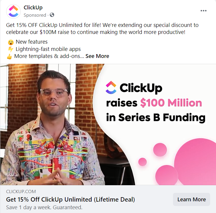
Why it works
Same CTA in the headline and the first sentence of the ad = the offer is clear (“Get 15% off”)
The CTA is supported by objection-handling statements, such as “save 1 day a week”, “guaranteed,” and a list of features
The “Learn More” call to action button assures the audience that they’ll get more info before committing
2. Shaw Academy
Can you spot all the call to actions in this Facebook ad? Hint: there are at least seven. Every element is coordinated here to instill a sense of urgency in the audience. Take note of the exploding colors, the alarm emoji, the many exclamation marks, and the multiple CTAs.
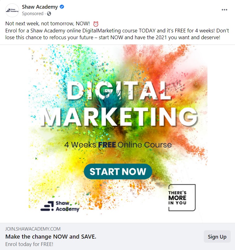
Why it works
Beautiful, contrasting colors with a CTA that stands out
Multiple call to actions
Sense of urgency to take action
3. Babbel
Babbel is a language learning app that comes at you strong with various CTAs for their Facebook offer. It works because even if you don’t know this app, it quickly establishes a trust factor (“over 500,000 5-star reviews”). The post then draws you in with an attractive offer.

Why it works
The primary call to action is clear and direct: “Get up to 60% off!”
They use the “Get Offer” CTA button to instill a sense of gratification in the audience
Including the action word “join” + the number of reviews in the same sentence is a way to evoke the feeling of belonging to a community
4. Hootsuite
Hootsuite keeps it brief and concise with a few very targeted CTAs.
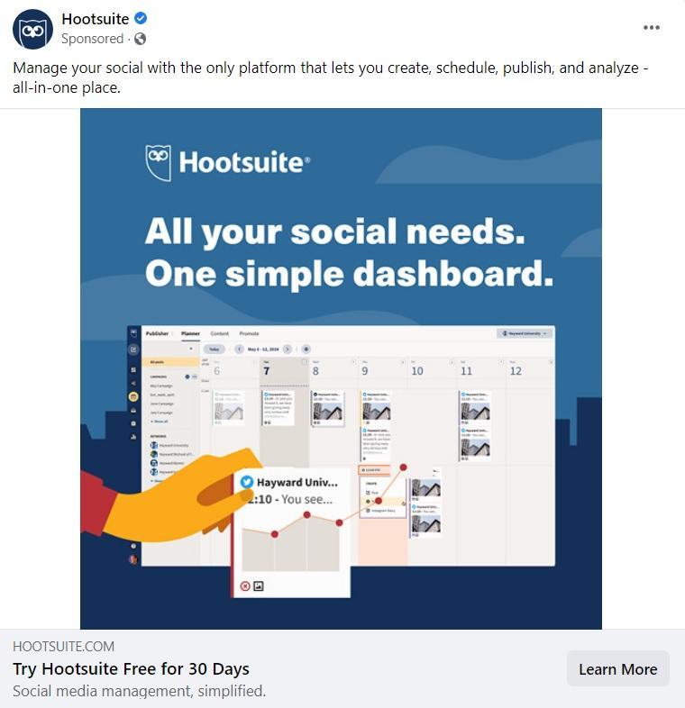
Why it works
All the call to actions are focused at the bottom while benefits are at the top of the post
The “Learn More” CTA button leaves any extra info for the landing page
5. Headspace
Headspace’s Instagram ad is the perfect example of a custom-made call to action. “Snuggle up to Headspace” evokes a cozy feeling in users and personalizes the brand. Words like “snuggle” fit into the category of sensory words.
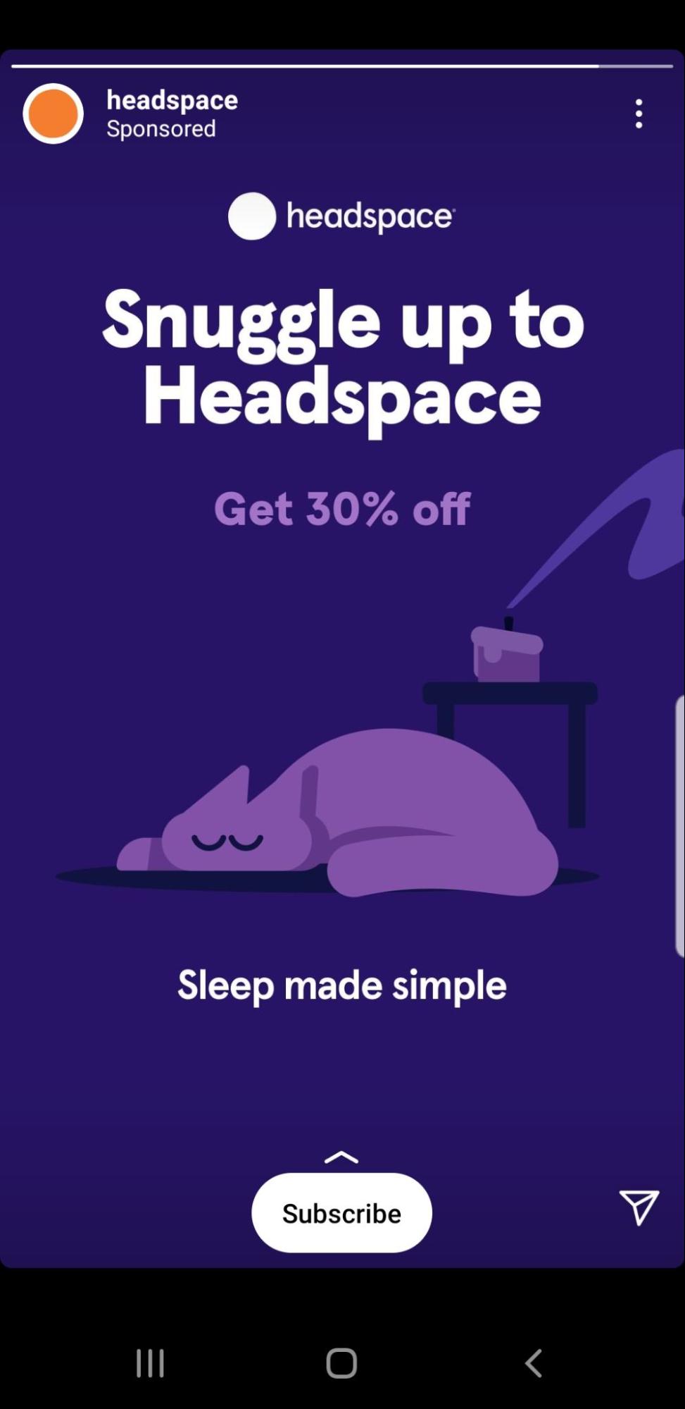
Why it works
They (smartly) opt to draw attention to the custom-made CTA and leave the “Get 30% off” as a secondary CTA
They use the CTA button “Subscribe” after that to make it clear how that snuggling up will happen
Coupled with a sweet, serene image, the whole CTA experience feels more like a gentle nudge for meditation and less like an ad
6. Elementor
As an event-type ad, Elementor gets it right. It displays all the key information regarding the event (name, speakers, date, and time).

Why it works:
The two most eye-catching elements on the ad are the headline and the call to action button. They both have the same contrasting colors that stand out against the dark background.
Both call to action buttons (‘Save Your Seat’ and ‘Book now’) are very concise and direct
The old-school flair of the ‘save’ icon next to the CTA button works well with the target audience (likely consisting of more technical people)
7. Nøie Skincare
You have probably seen call to action examples like this in the advertising strategy of ecommerce brands. The main goal is to sell. At the same time, the ad focuses on the experience instead of rushing to take the user to a web page. In this case, “Shop Now” is the type of CTA that is direct, yet, the ad copy does most of the selling.
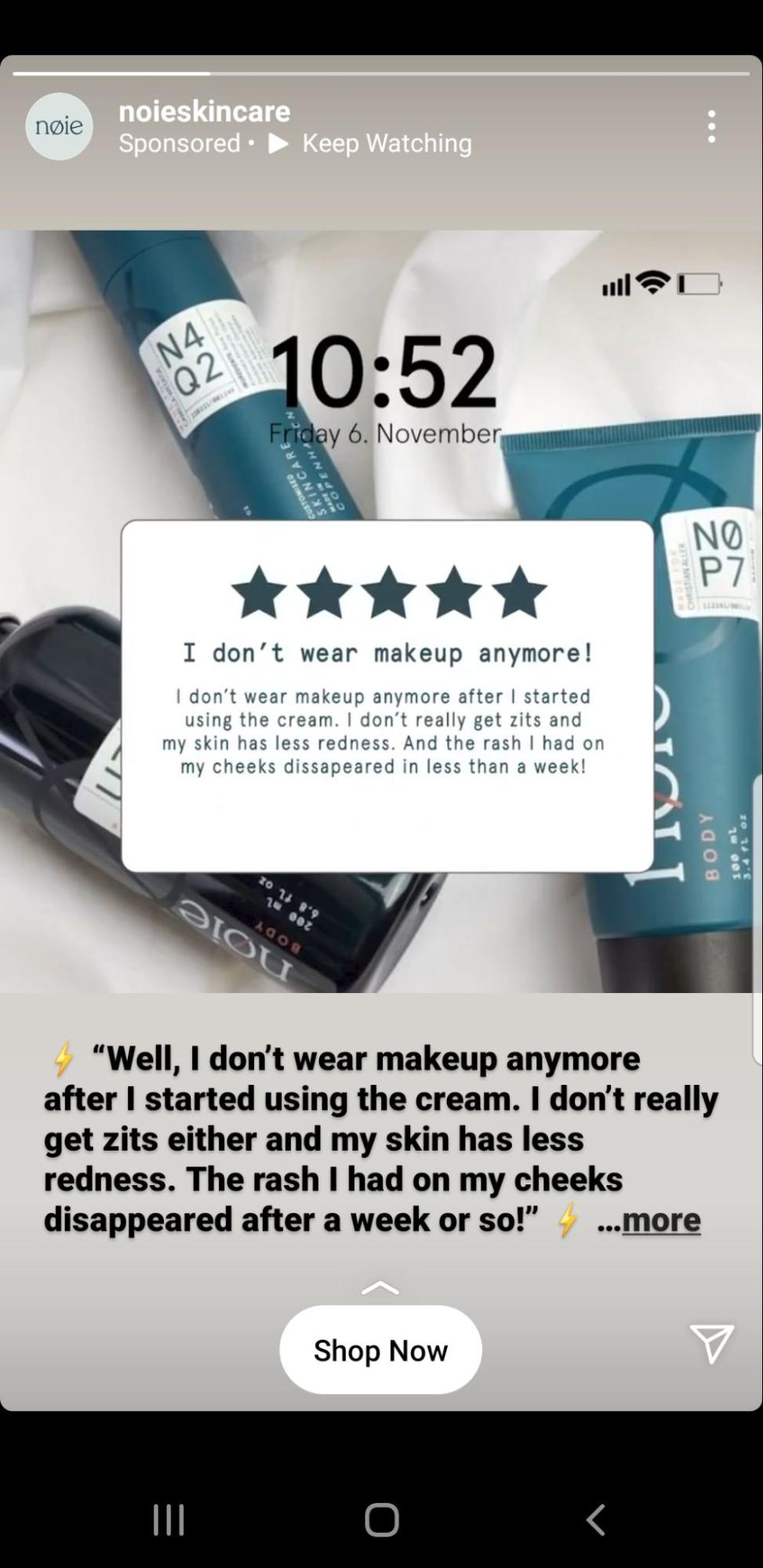
Why it works
The emphasis is on the product experience, which makes having just one call to action sufficient
“Shop Now” is direct and to the point. The prospective customers know where they will be taken from the post
8. VAI Course
Esther Inman’s VAI Course ad keeps it fresh with the colors and a simple call to action button.

Why it works
The CTA text on the ad itself boasts about its main USP: the user gets a remote job pack every Friday
The “See More” call to action button leaves the audience at ease knowing that they can still learn more about the product before signing up
9. Black Illustrations
Design agency, Black Illustrations prefers to use multiple CTAs in their email marketing. You can run your own test on this strategy, but it makes sense to include a few secondary call to action buttons if you have a relatively long email. Black Illustrations also adds a hyperlinked CTA to further help guide users to take action.
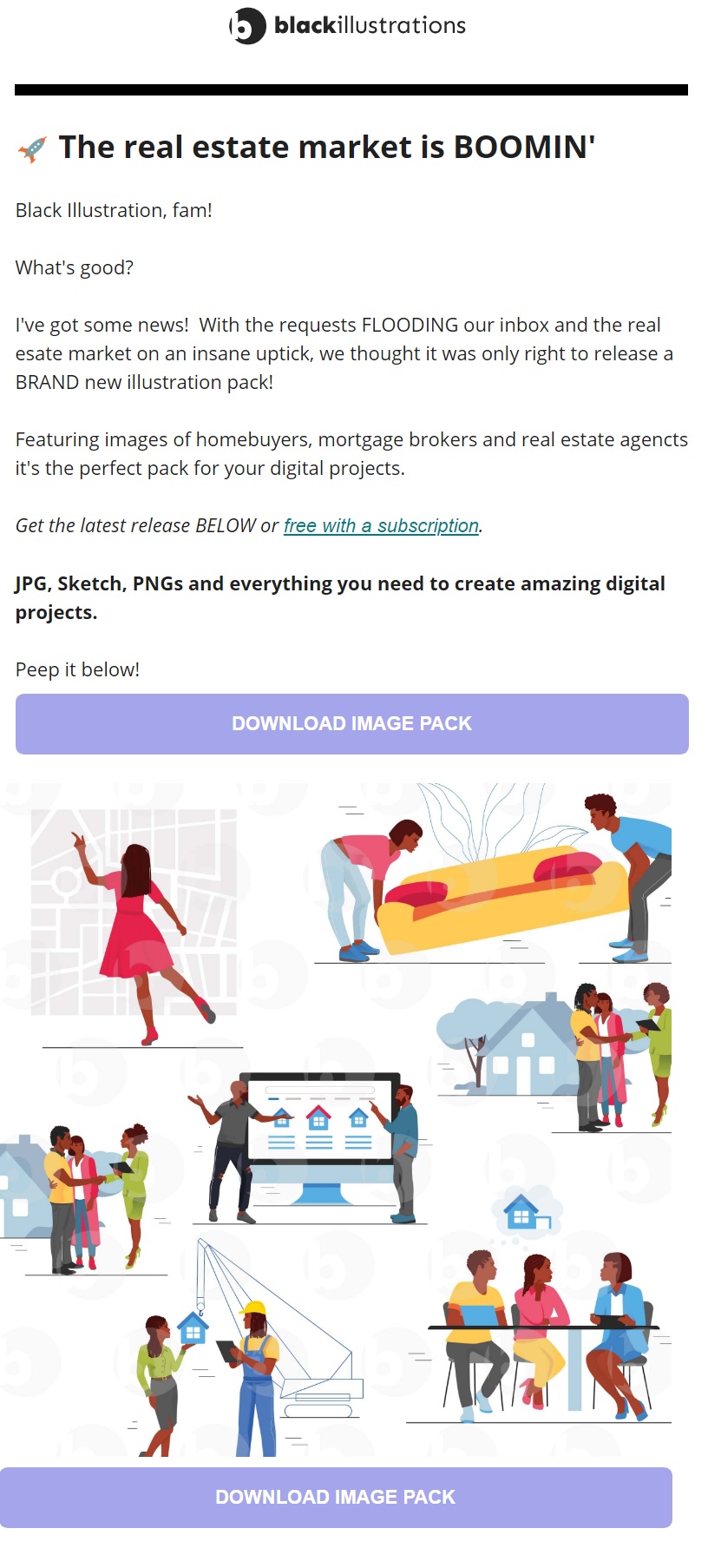
Why it works:
Multiple CTA buttons (and hyperlinks) in a long email can increase your conversion rates.
“Free with a subscription” stands out and keeps the main message clear for the user
The color choice for the button works well with the brand yet still stands out
10. Audiense
The audience analysis tool, Audiense, prefers the long CTA route in their email marketing. Phrases like “show me…” or “take me to…” create a clear value proposition and helps the user feel in control.
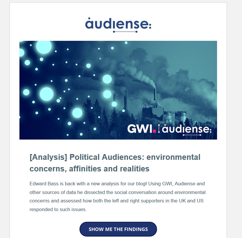
Why it works:
Using multiple words and first-person phrasing in your call to action could increase your relatability and CTR
Users get a better sense of the type of page that awaits them after clicking
When using a long-form CTA, you get to test a wider variety of versions
Landing page CTAs
Landing pages are great subjects to run a CTA test or two on. Below are some great call to action examples for your next campaign.
11. Tim Ferriss
Tim Ferriss’s email sign-up landing page is as minimalistic as it gets. No top menu, no links, or other distracting web components.
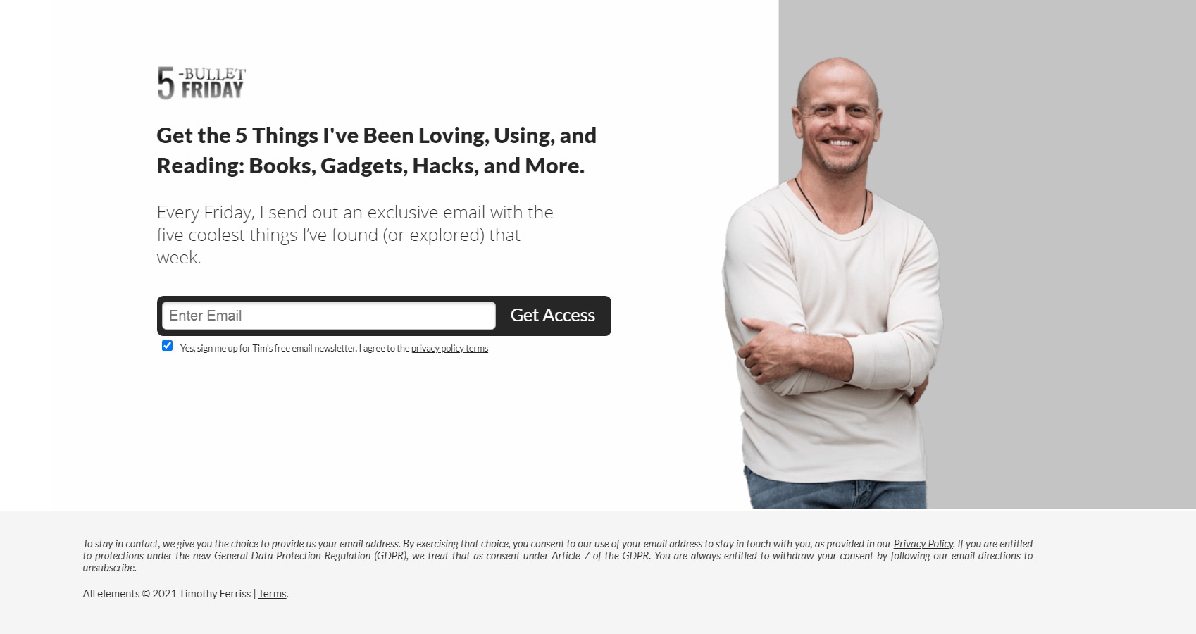
Why it works:
The distraction-free page keeps the focus on the main CTA: to sign up for the newsletter
The black headline and black CTA button provide a striking contrast to the white background
“Get access” is a great call to action to use if you want to establish the feeling of receiving exclusive content in the user
12. Joy
Joy is a Canadian company that offers a razor subscription service for women. Their landing page is concise and fits all information to the visible area. The CTA button stands out as it’s the darkest element on the page.
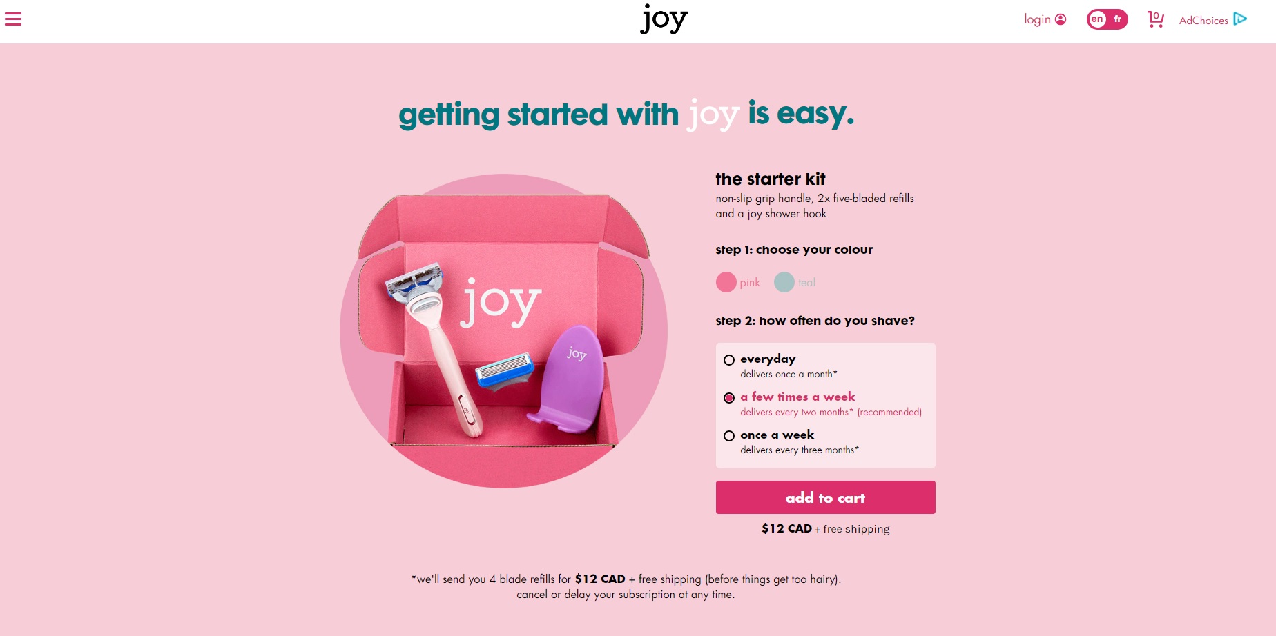
Why it works:
The contrasting color of the button helps users easily navigate to the next step
The CTA copy itself follows ecommerce best practices: “add to cart” is an easy-to-recognize button in the industry
The small-cap lettering (which fits the brand) lends a unique look to an otherwise highly used CTA
13. Leadfeeder
Leadfeeder’s own lead-generation landing page is simple with a clear value proposition. On the left, you get a summary of the ebook. On the right, you will need to provide some basic info and then click “Get the Guide” to submit your request.
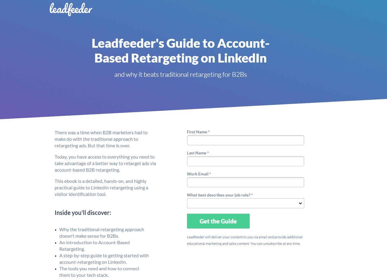
Why it works:
The CTA button is the only green item on the page
“Get the Guide” engages the users with a clear offer
14. Touchland
Touchland is here to sanitize your hands without making a mess. The “checklist” on the left (keys, wallet, phone, touchland) is cheeky. It’s a clever storytelling technique to place visitors into a familiar scenario while introducing the product.
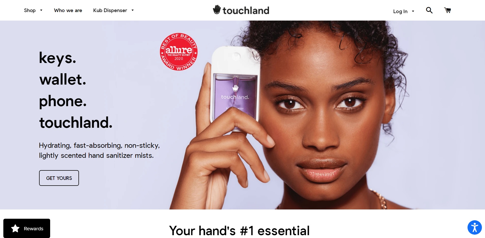
Why it works:
“Get yours” implies that a lot of people already have one – you will only fit in if you get yours
The transparent call to action button gives the website an airy feel to it, which is on track for a business that sells a mist
15. Airbnb
With COVID-19 restrictions coming and going, travel sites like Airbnb have to develop ways to stay top of mind. They achieve this by featuring a wishlist of outdoor spaces and a dreamy illustration on their website.
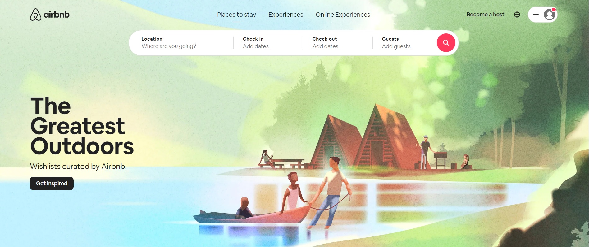
Why it works:
“Get inspired” is a soft CTA that invites the user to explore ideas for future travel (and remarketing)
The call to action button itself stands out against the pastel-colored background
16. Smartlook
Smartlook is a user behavior analysis tool. They closely follow website best practices by placing a “hero” section above the fold (tagline+description+CTA). The main goal of the site is to prompt visitors to sign up for a free trial.
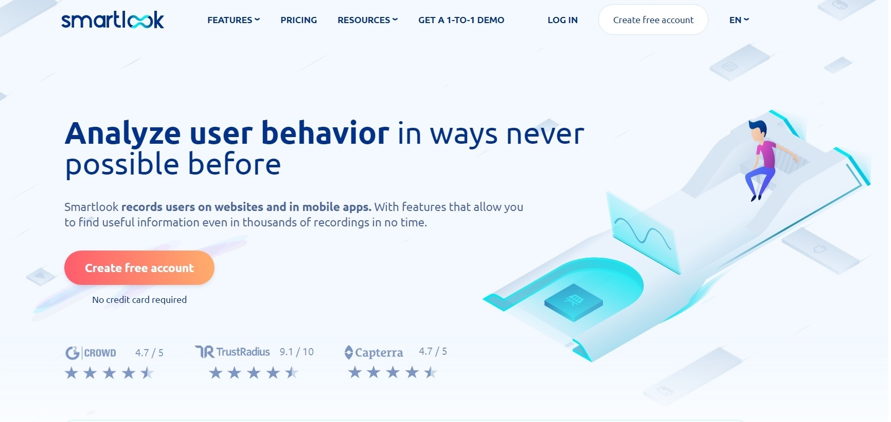
Why it works:
The colorful call to action button provides a stark contrast against the grey and blue background – an immediate eye-catcher
Using red and yellow colors on the button evokes a mixture of excitement and optimism in hesitant visitors
The copy on the button says “Create free account” and the supporting text underneath is “No credit card required.” Both copies aim to overcome the subconscious objections of prospective users (Will it cost me anything? Will they charge my credit card?)
17. Ecom World
Ecom World is the website for “The World’s Largest Ecommerce Event.” They placed all of the most important info above the fold: what+when+where+the CTA.
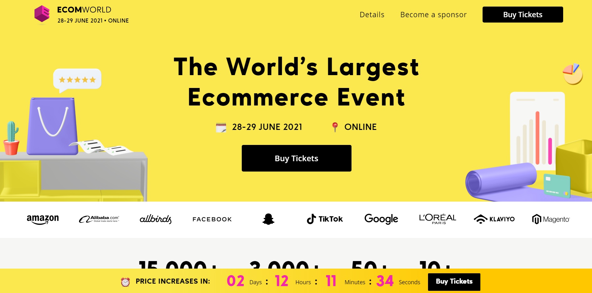
Why it works:
The call to action button coordinates well with the rest of the design elements. Throughout the site, the most crucial info tends to be highlighted in black.
Multiple CTAs could increase conversions. Here, the “Buy Tickets” CTA appears three times above the fold alone (main navigation, in the hero, and in the sticky nanobar)\
Last updated